Lêmure
Discovery
Prototyping
2019
Employer
Lêmure is a project I participated in while I worked at Catarinas Design, an Interaction Design consultancy.
Goal
The project's goal was to create the app through which the company would provide its service. A service that enables the financial lending from individual to individual with minimal bureaucracy and lower rates than banks.
Note: it was not an MVP, but rather an integral project with various functionalities.
Pain
For the borrower, there is a range of solutions, ranging from traditional bank loans to retail store loans. The only problem is that the common point these loans bring are very high interest and a huge bureaucratic process.
For the investor, there is a range of solutions focused on variable income, however, these solutions always bring a high collection fee for bridging the investor and the investment.
Role
We conducted the project, Leandro Martinez and I, where we divided ourselves through all stages so that there would always be an exchange. Both he and I did everything from contacting the client to creating the app's UI, counting on feedback from colleague designers and the supervision of Priscilla Alcantara, co-founder of Catarinas Design.
Desk researching
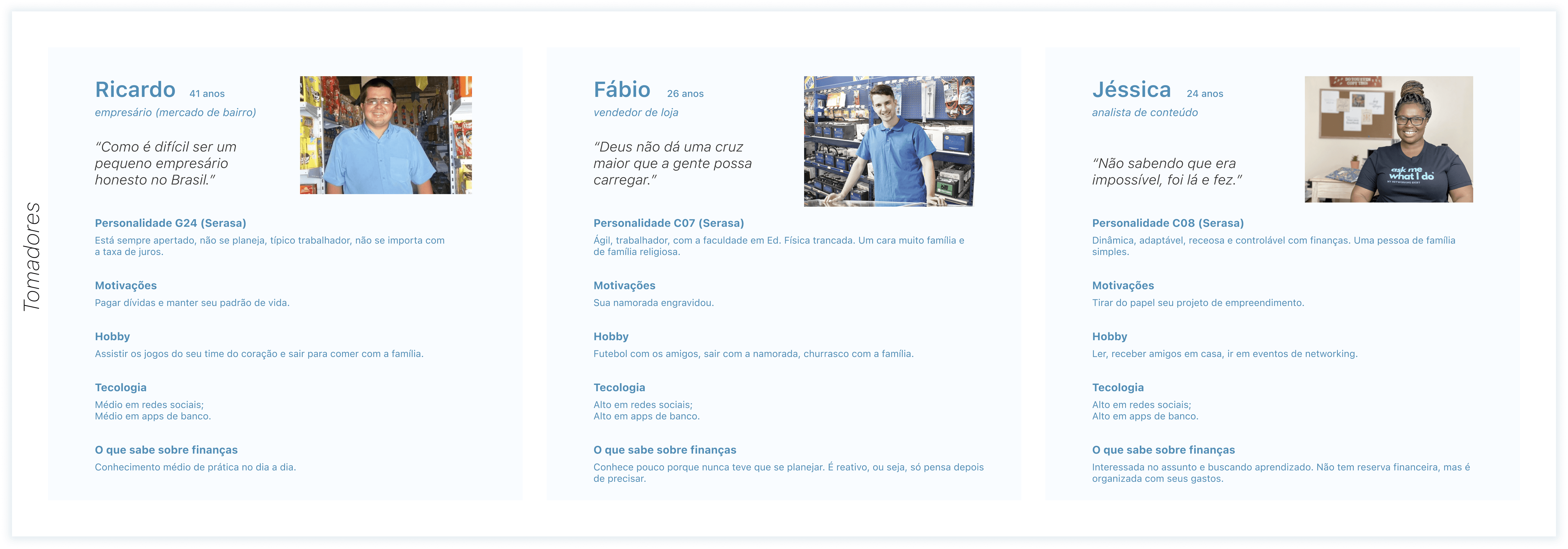
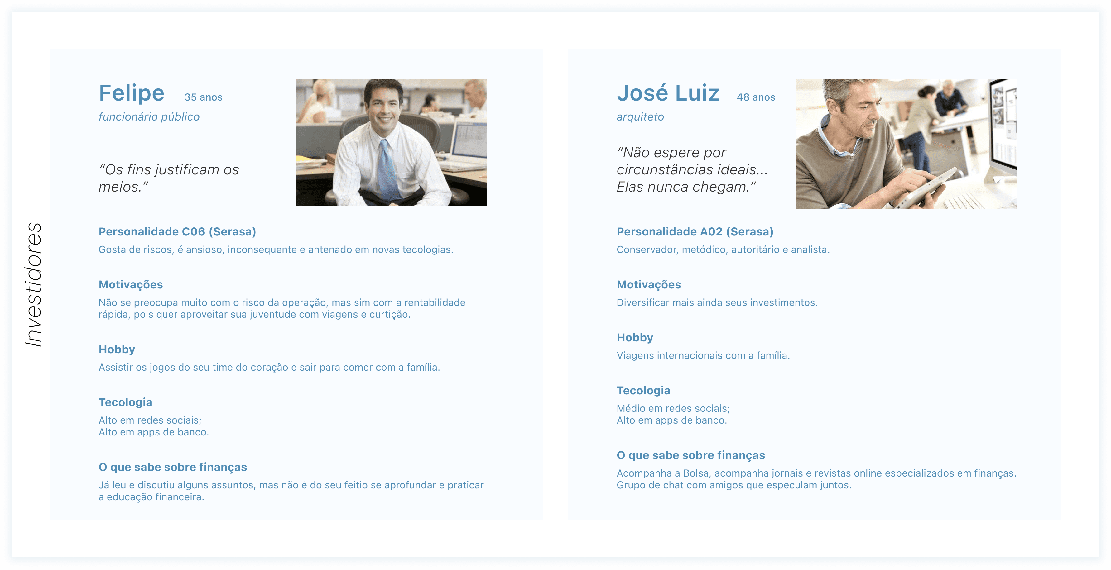
As we were dealing with a client in a consultancy, who already had his business validated, we could count on a wide range of materials and data about the client's value proposition, so this stage was based on studying the technical flow of the application, persona data, and competitor analysis. Here we were able to create the user personas profiles based on the competition's personas and the data that was passed on to us by the client.
Thus we identified the profile of our borrower users (those who borrow the money) and our investor users (those who lend the money), separating these profiles into extreme users and generating 5 main personas for the product.
Co-creation workshop
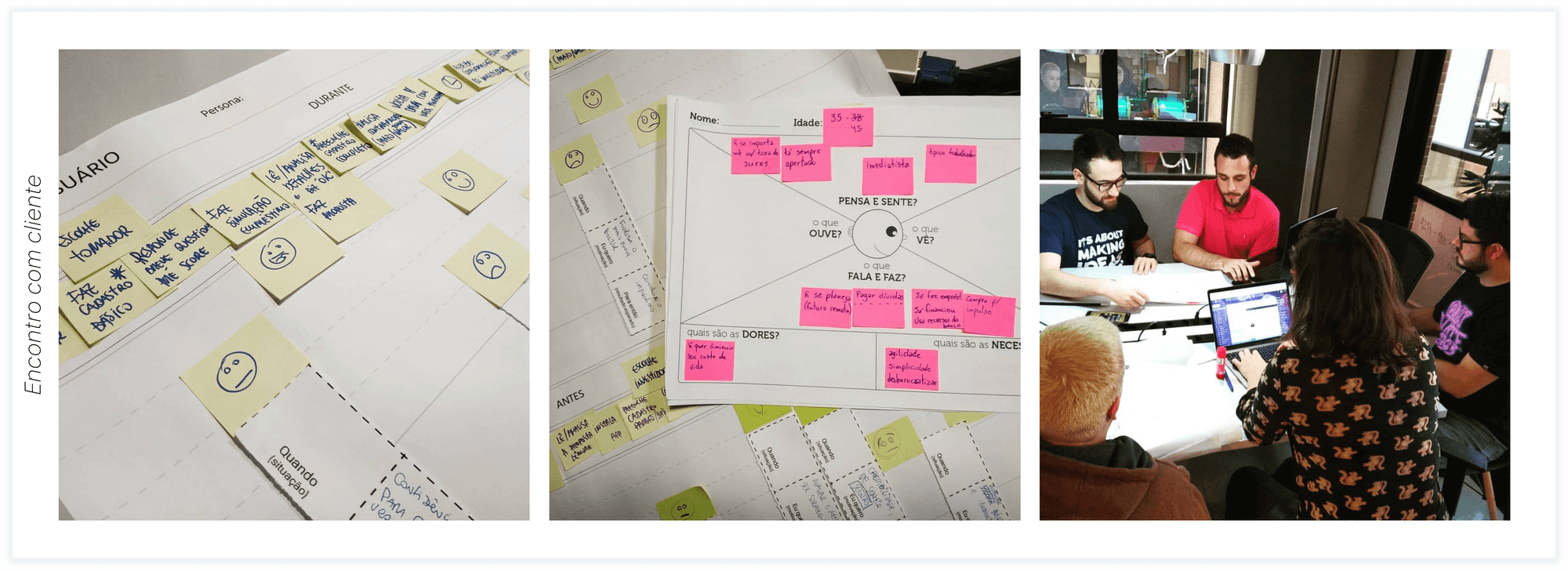
We joined the client (I'm the little yellow hair there in the corner 😅) to document the user journeys, create empathy maps and from that better understand the bureaucratic limitations of the application flow and the pain points of each persona within the service flow that Lêmure provides.
Information architecture
Here, with the user's pain being latent in our perspective, we start assembling the flowchart of the application in Miro with a content inventory per screen based on the user journey and taking into account the technical and bureaucratic limitations and how to circumvent them without that becoming a point of frustration for our user, always validating with the client's development team.
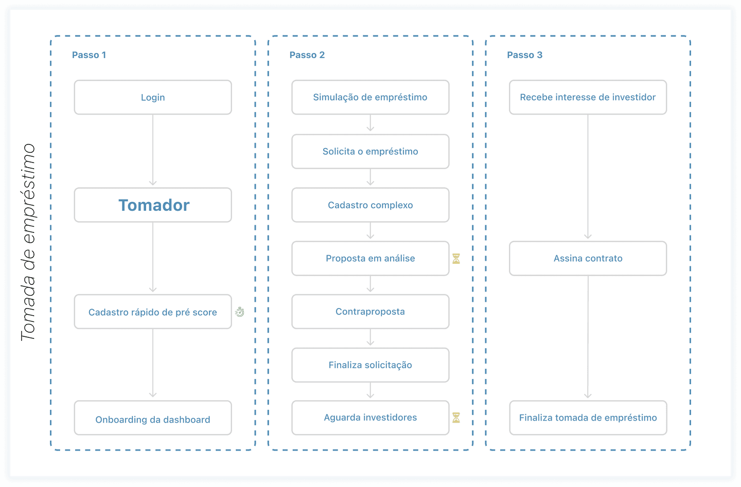
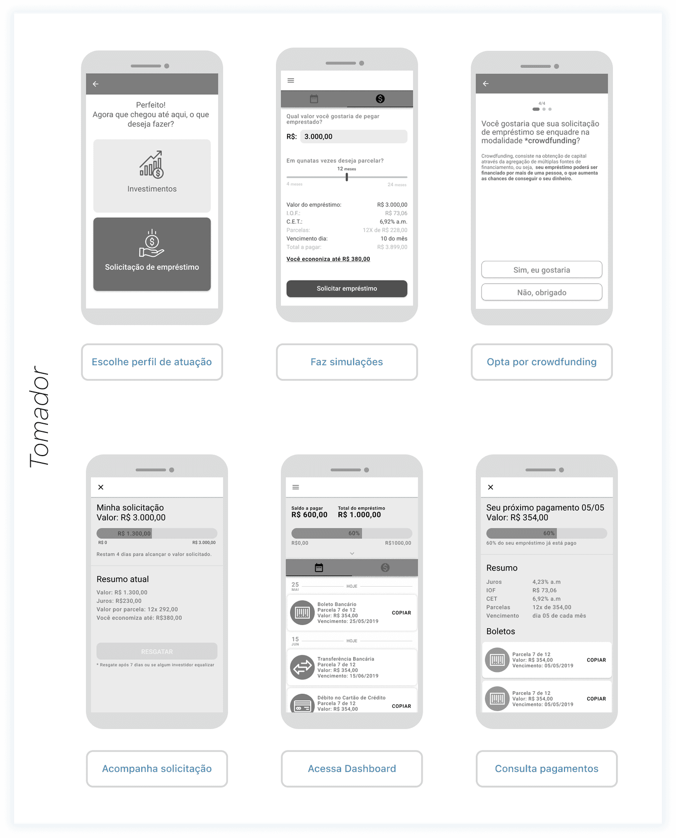
In addition to the main process of the borrower's profile, which is illustrated in a macro way in the flow chart on the side, the application also had other functionalities for the borrower's profile that I will not document here. But they are:
Save proposals for a later request;
Visualization of the score and its increase through guarantees;
Bill inquiries;
Payment tracking;
Change of role profile (to investor);
Help.
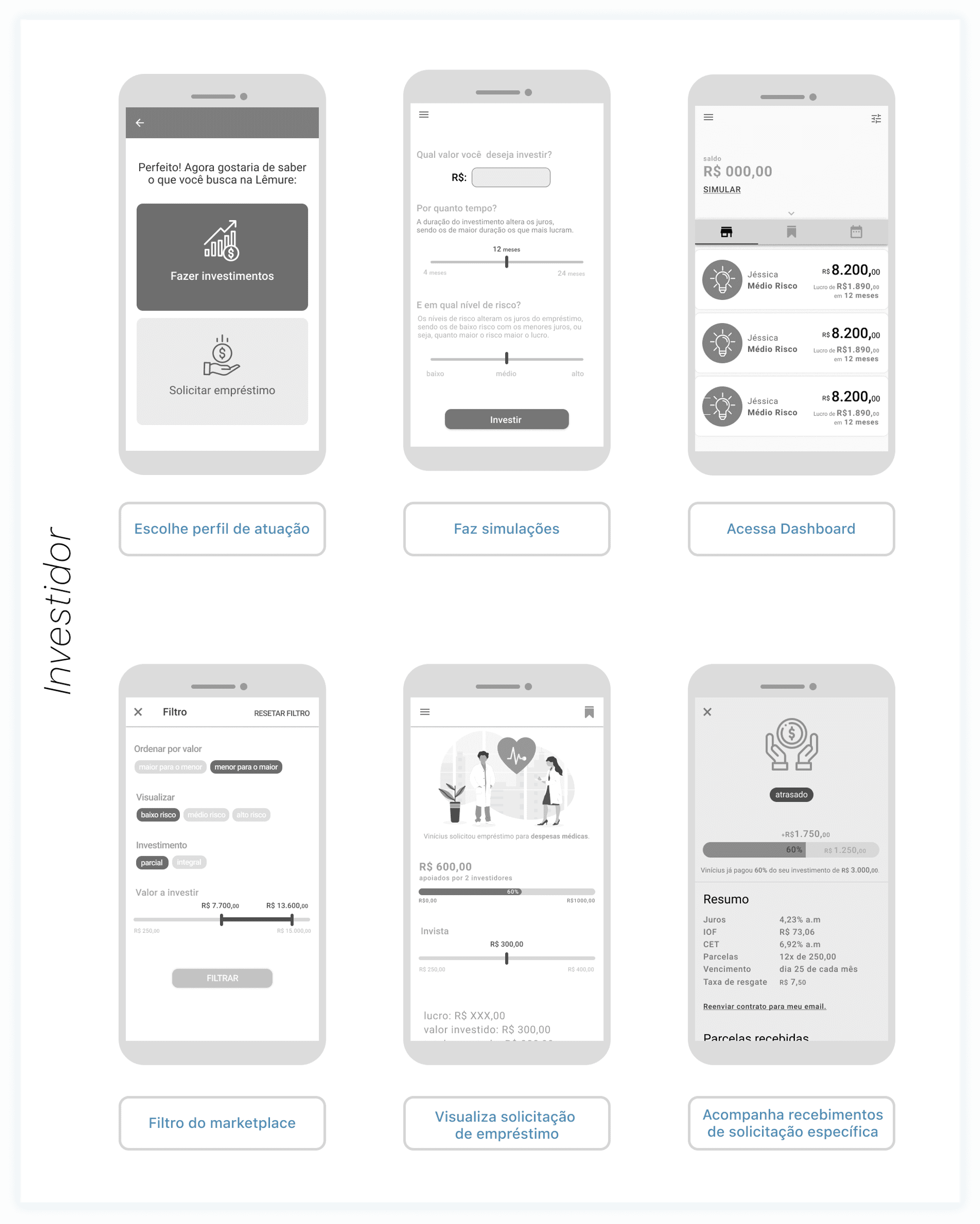
The investor process also included the ideal contract closing journey, but prior to that there were also other features that I will not document here:
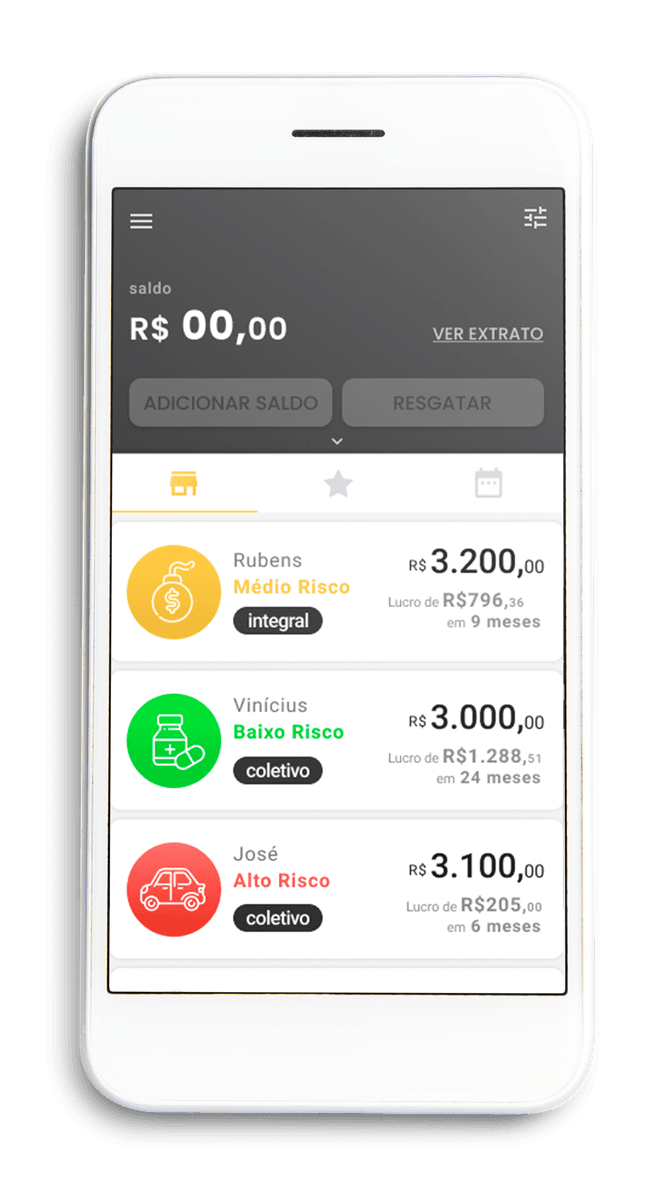
Marketplace for loan requests;
Pending transactions;
Wallet;
Change of role profile (to borrower);
Help.
When we were planning the investor's flowchart, we identify a very interesting business opportunity about the possibility of crowdfunded loans, that is, more than one investor could lend money to the same borrower. And then we took this idea to the project with the intention of validating it in usability test interviews.
From the flowchart, we started to draw the screens on paper, to structure the architecture of the contents and so that we could get feedback from our colleagues more quickly and also so that we could notice possible limitations in the flow. At this stage we had a very rich construction when we counted on the feedbacks from other designers and when we took possession of technological strategies from other digital products on the market, such as Nubank's fully digital registration and Inter's investment simulation strategy.
Prototyping
After finalizing a functionality flow on paper, we moved it to Figma in a medium fidelity wireframe. This would become the navigable prototype to be tested, composing a fluid navigable flow of the functionalities to be tested.
As the project moved in the dynamics of the consultancy, there was no need for quick deliveries and an agile methodology. So we continued building a complete navigable flow so that we could test the functionalities in a single interview, considering a limitation we found when recruiting investor personas. The investor profile fits people with a daring profile, who invest in variable income and usually have great monetary power. For these people, time is money and a gift/incentive to contribute to research was not so inviting. So due to the shortage of participants, we opted to generate a complete script that would be tested all at once with these participants.
Here are some examples of the first wireframes done on Figma collaboratively by me and Leandro for the flow of borrowers.
These are the screens that are part of important points in the flowchart described earlier, where the main function of the app is completed.
And here are some wireframes of the investors' flow, also collaboratively made by me and Leandro in Figma.
I also chose to show the screens of important points in the investor's journey in the app, and also took into account the level of complexity of the screen.
Usability test
To carry out our usability test, we recruited 8 borrowers and 5 investors, we created a comprehensive script, which as I mentioned above, included a path through all the functionalities to be tested. Below I show a little of the planning of the tests developed for this stage and I will also present the methodology used in the compilation.
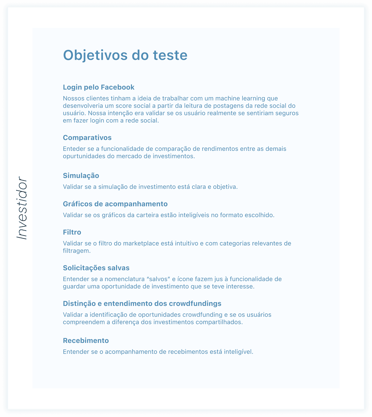
We create goals aligned with our navigable flow and from these goals, we create a task roadmap that directed the user to stay in the prototype flow, but without biasing the use.
I leave here some parts of the script derived from these goals:
I would like to ask you to make your first access to the application.
How would you find out how much you would earn on a 3,000 real investment?
Now that you have investments in your portfolio at Lemure, how would you find out information about your future earnings?
Could you tell me how the situation of your investment in Vinícius has been in recent months?
And if you really liked this investment opportunity and wanted to save it to analyze later, what would you do?
And where would you find the investment opportunities that you saved to consult again?
Learnings and solutions
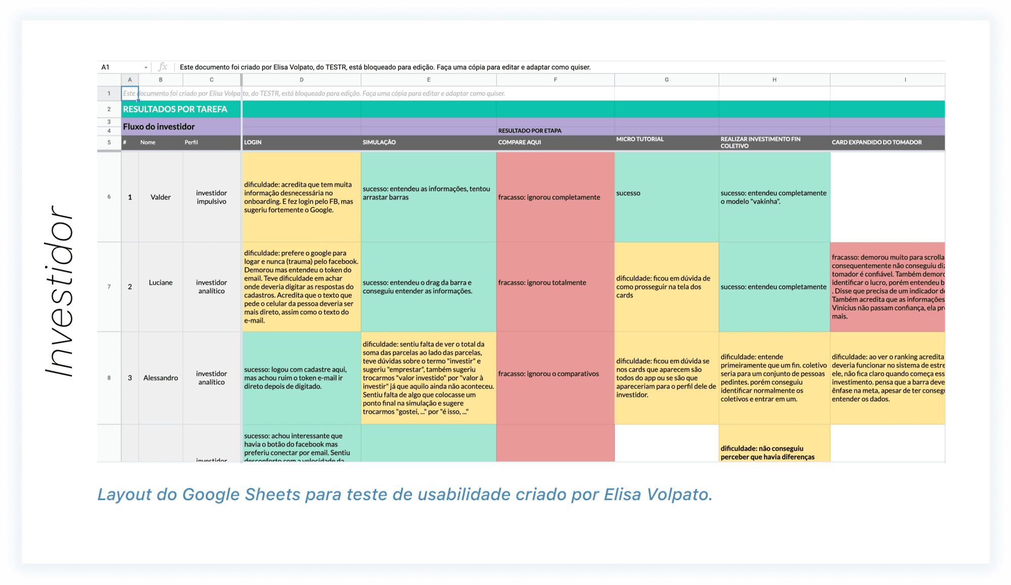
Collecting the results of our tests we found common points among our users, as can be seen in the table above, and we used these points along with the feedback from the interviewees to make improvements to the final interface of our project. Next, I present some examples of feedback and validations we used at this stage.
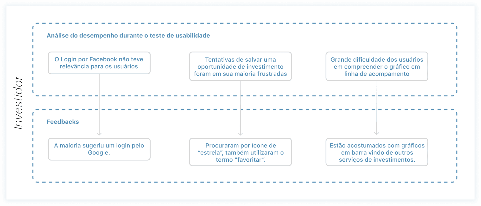
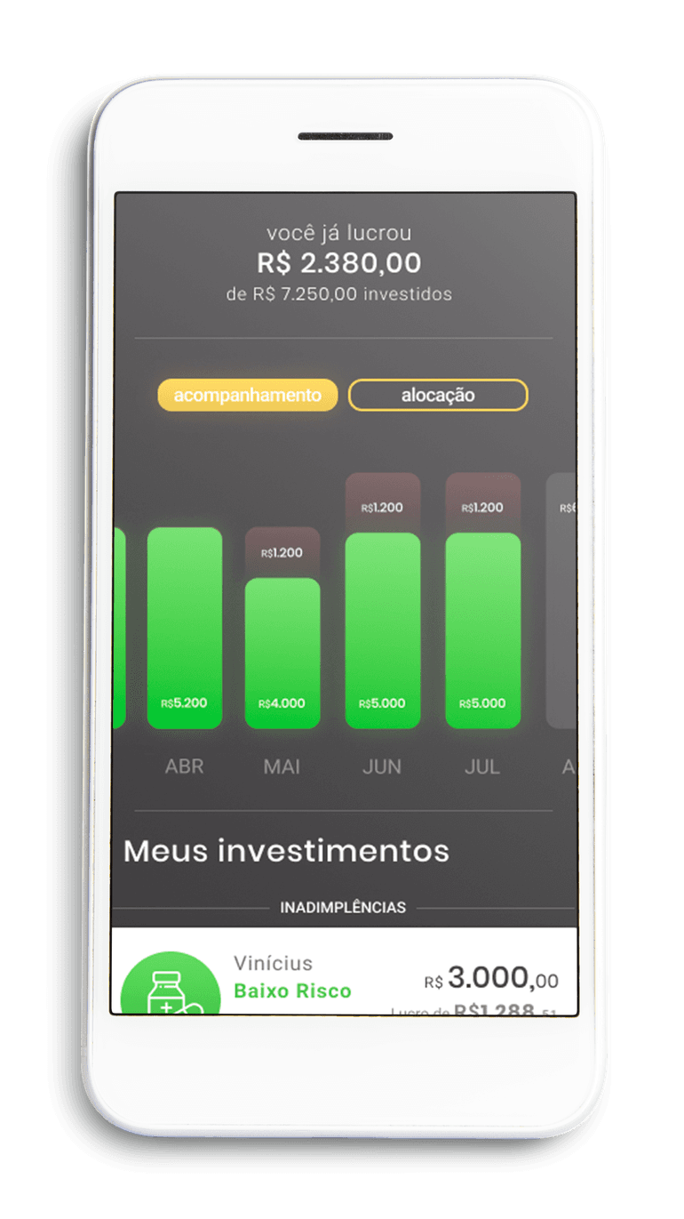
The solution we found for investment tracking was to transform the previously made line charts into bar charts, as can be seen in the mockup.
As for the "saved" investment opportunities section, we followed the suggestion of our interviewees who commented they were looking for a "star" when they wanted to save an opportunity or go to where the already saved opportunities were.
This was a bit of my process in one of the projects I worked on during my time at the Interaction Design consultancy, Catarinas Design. Thanks for your interest! 🎉